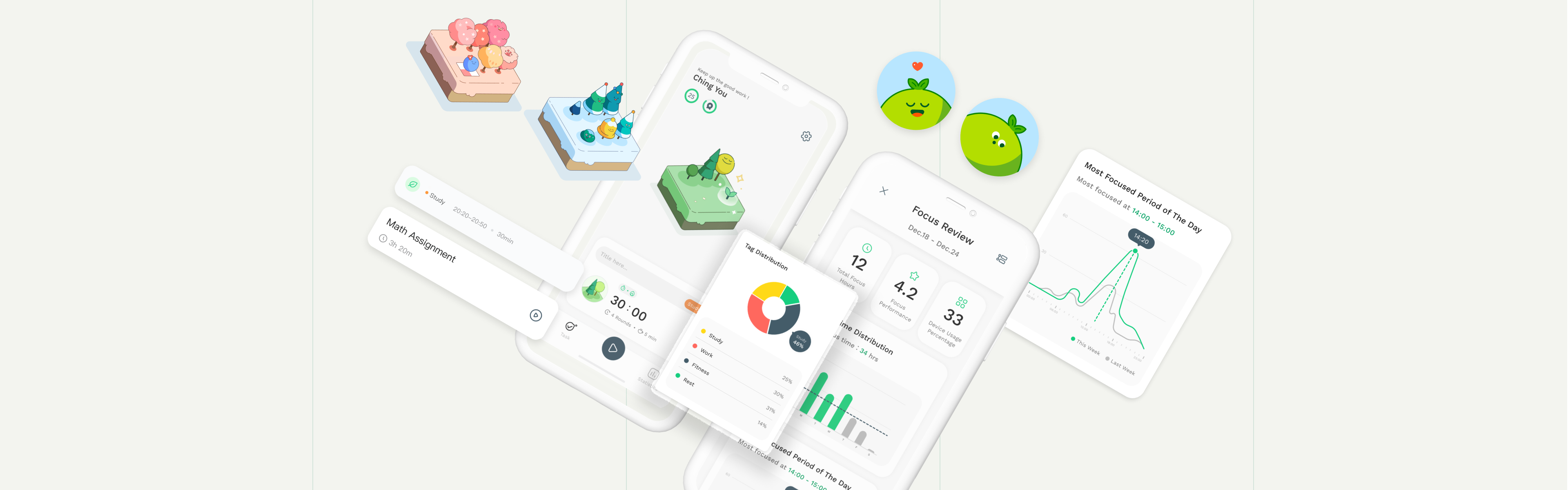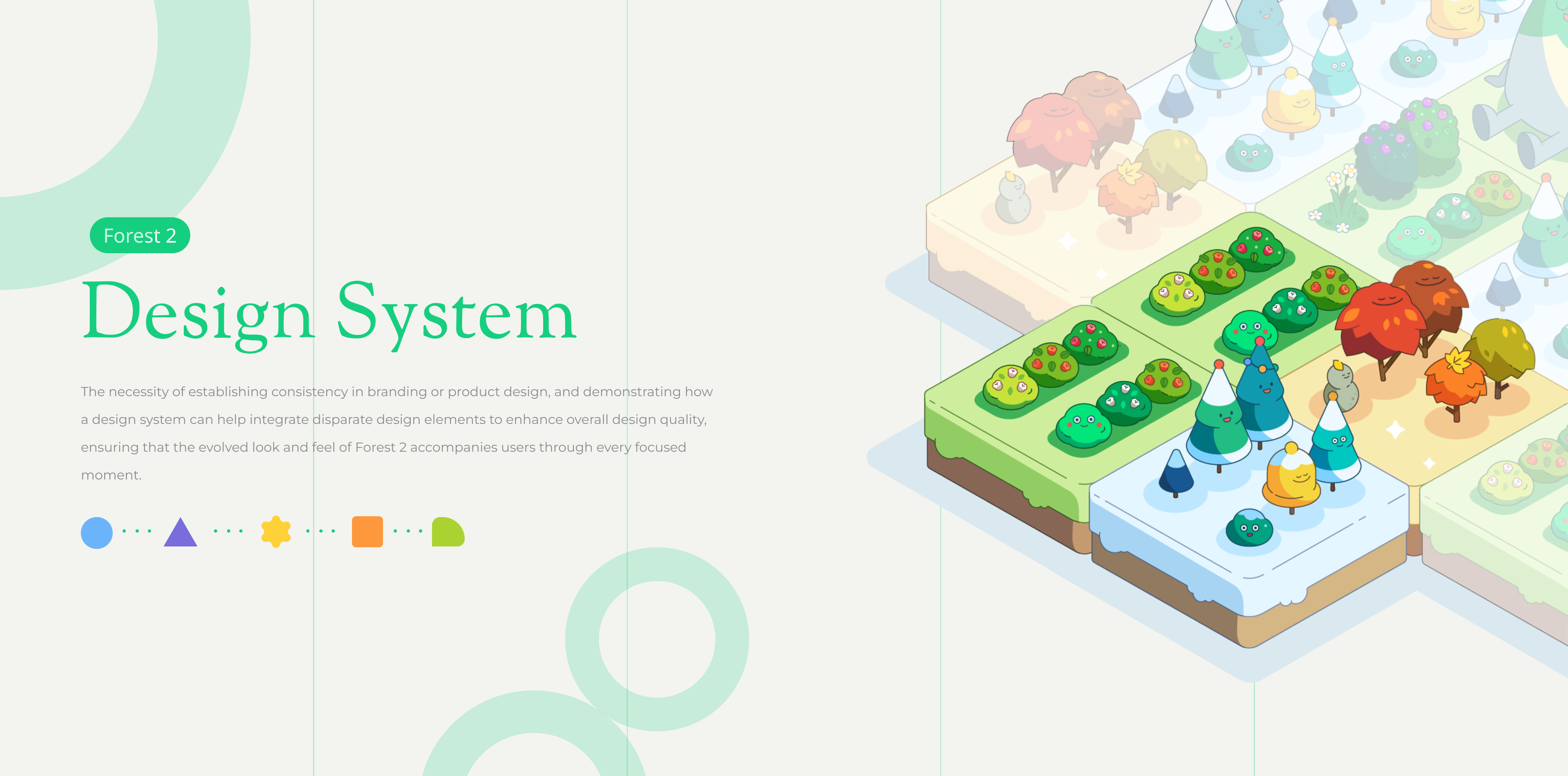
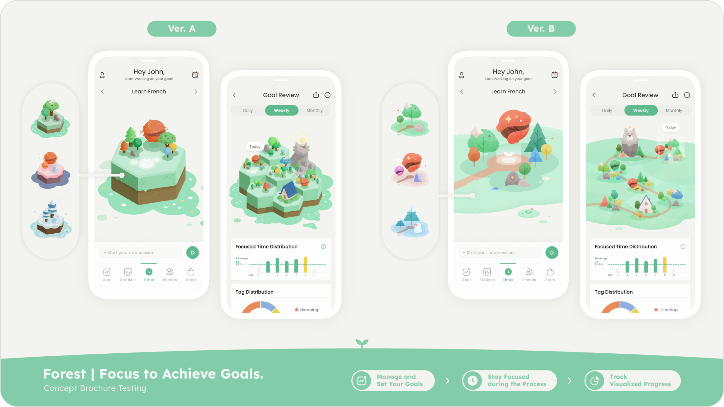
For Forest 2, we aim to develop a design system that fosters an atmosphere of motivation and companionship, crucially reducing stress for users while they focus.
Based on the product feature positioning of Forest 2, we have proposed five "keywords" that enable the team to effectively discuss and converge ideas on the visual perception presented by each page, making adjustments as necessary. This approach aims to maximize the potential of visual design to enhance the user experience.
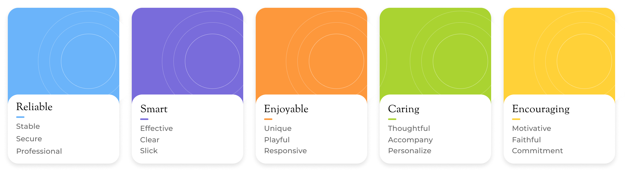
We will conduct concept testing of the initial visual style during user interviews, asking users about their feelings and experiences with the new visual style. This will help us gauge user expectations for the visual style of Forest 2 and serve as a benchmark for further optimization.
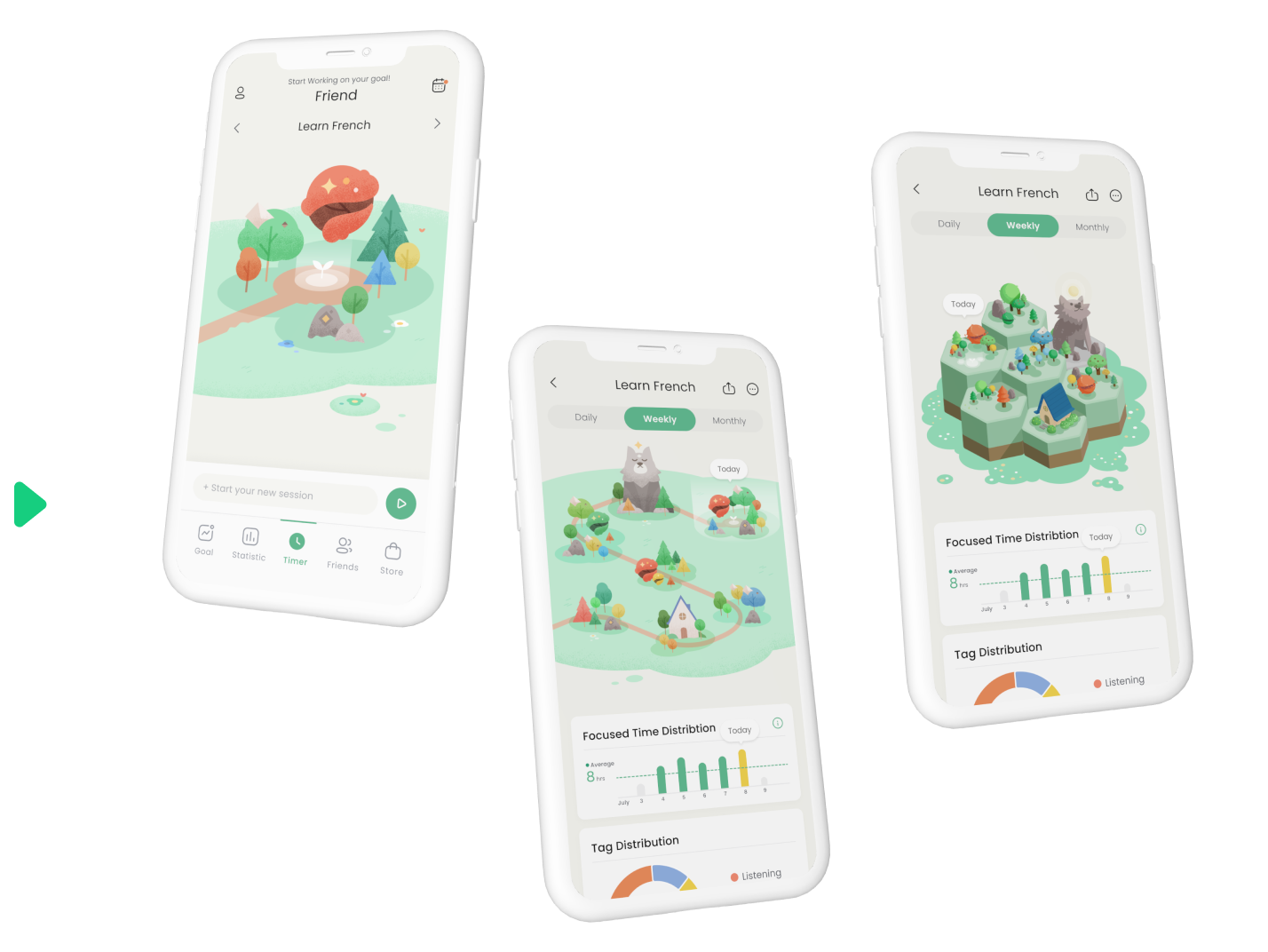
Ultimately, we will consolidate the opinions of both the team and the users, selecting three key pages to apply and showcase the different key terms, as well as to capture the experience they convey. This will assist the team in aligning the overall visual style and tone, and also enable the team to converge ideas and facilitate discussions using the key terms.
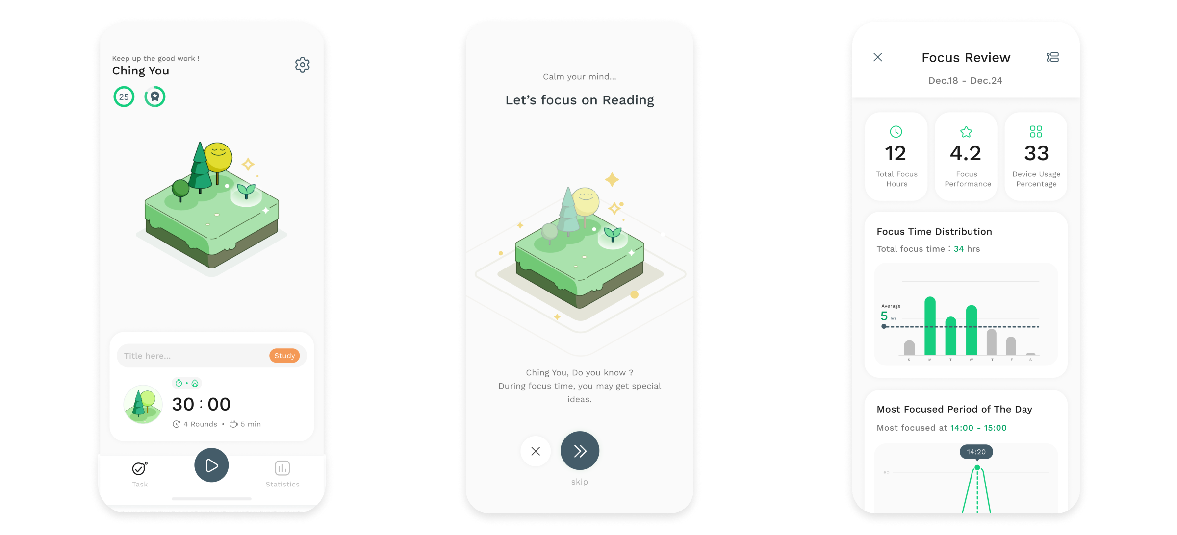
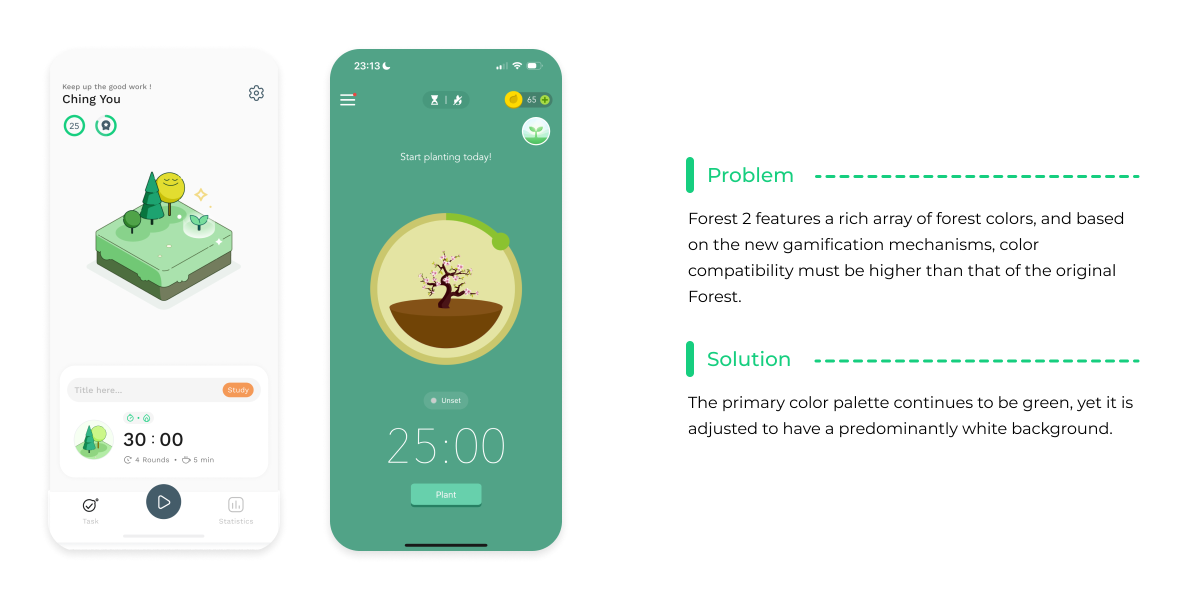
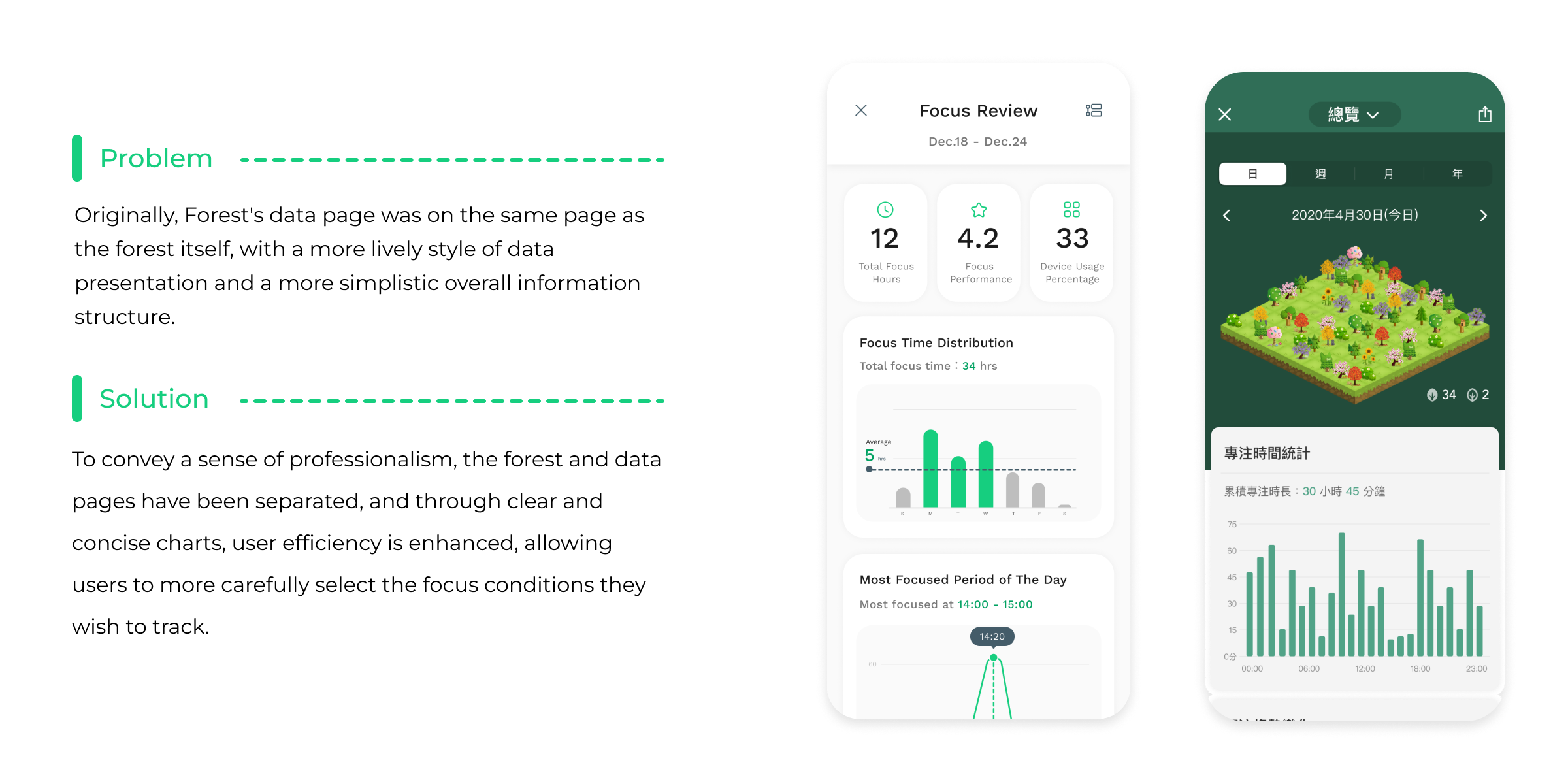
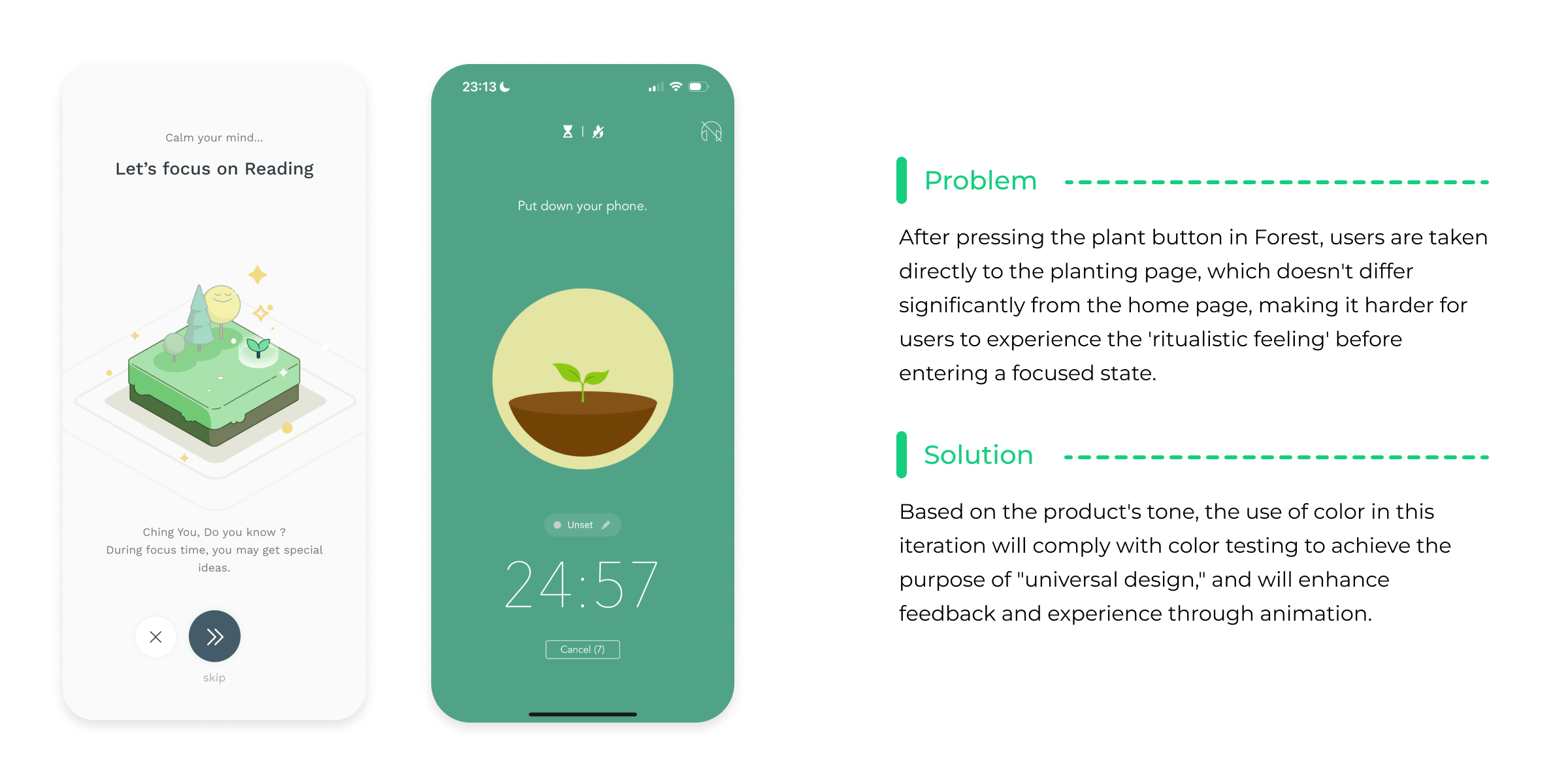
Since the core mechanism of Forest is to continually motivate users to focus through a gamified interface (by growing a forest with focused time), the visual style is extremely important in the presentation of the focus process pages. Consequently, the interface design must be clear and easy to understand, minimalist and clean, with intuitive operations, and possess a page style with stronger color compatibility compared to Forest.