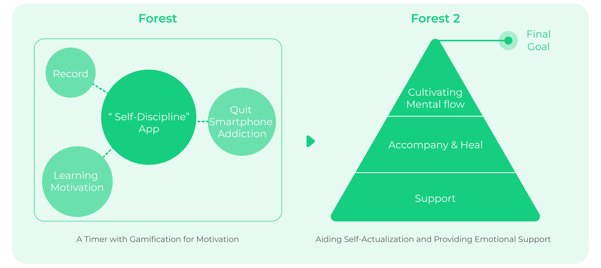
The initial core concept of the product was to maintain focus, quit smartphone addiction, and combat phone dependency. However, as the pandemic evolved, "quitting smartphone addiction" no longer met the current user needs. Additionally, Forest's original positioning as a tool-oriented product limited its use cases and conversion rate. Thus, "How can users utilize Forest 2?" became the critical question in repositioning the product. In response, the UX team organized workshops to discuss new product strategy directions with core team members.
We will conduct concept testing of the initial visual style during user interviews, asking users about their feelings and experiences with the new visual style. This will help us gauge user expectations for the visual style of Forest 2 and serve as a benchmark for further optimization.
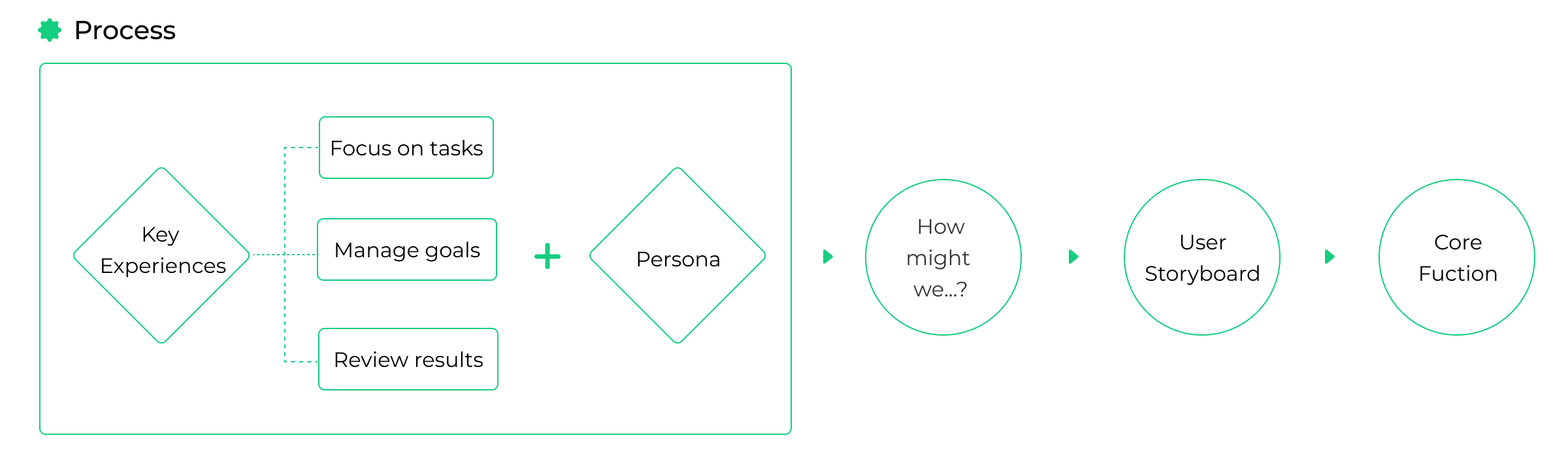
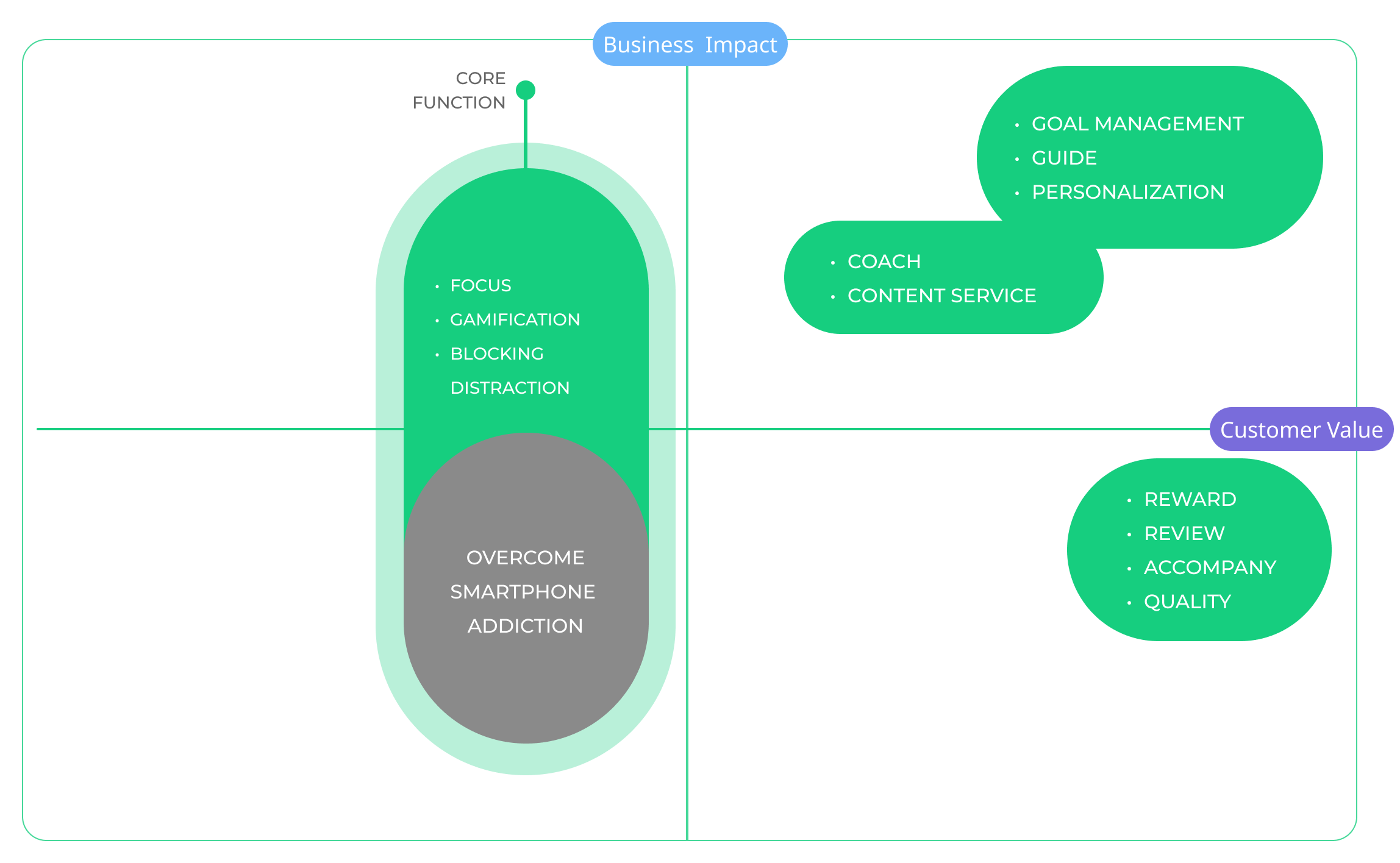
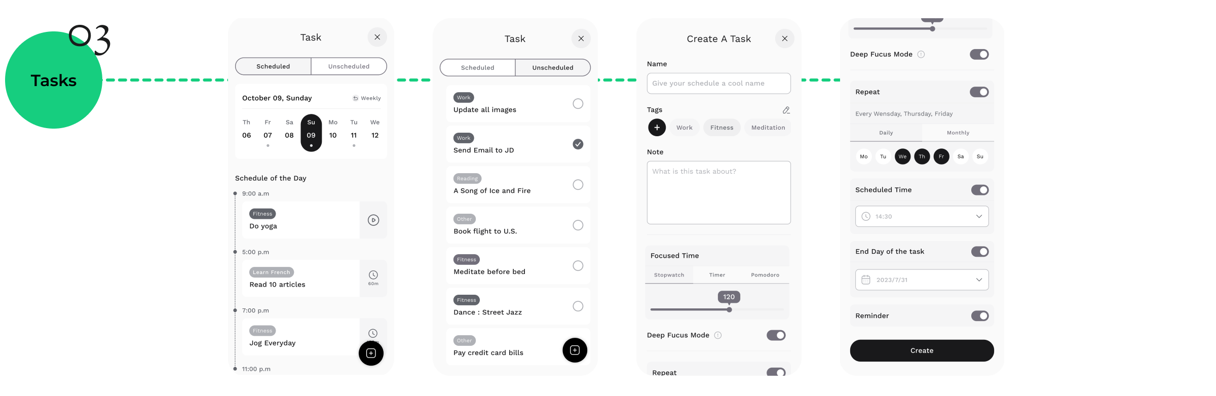
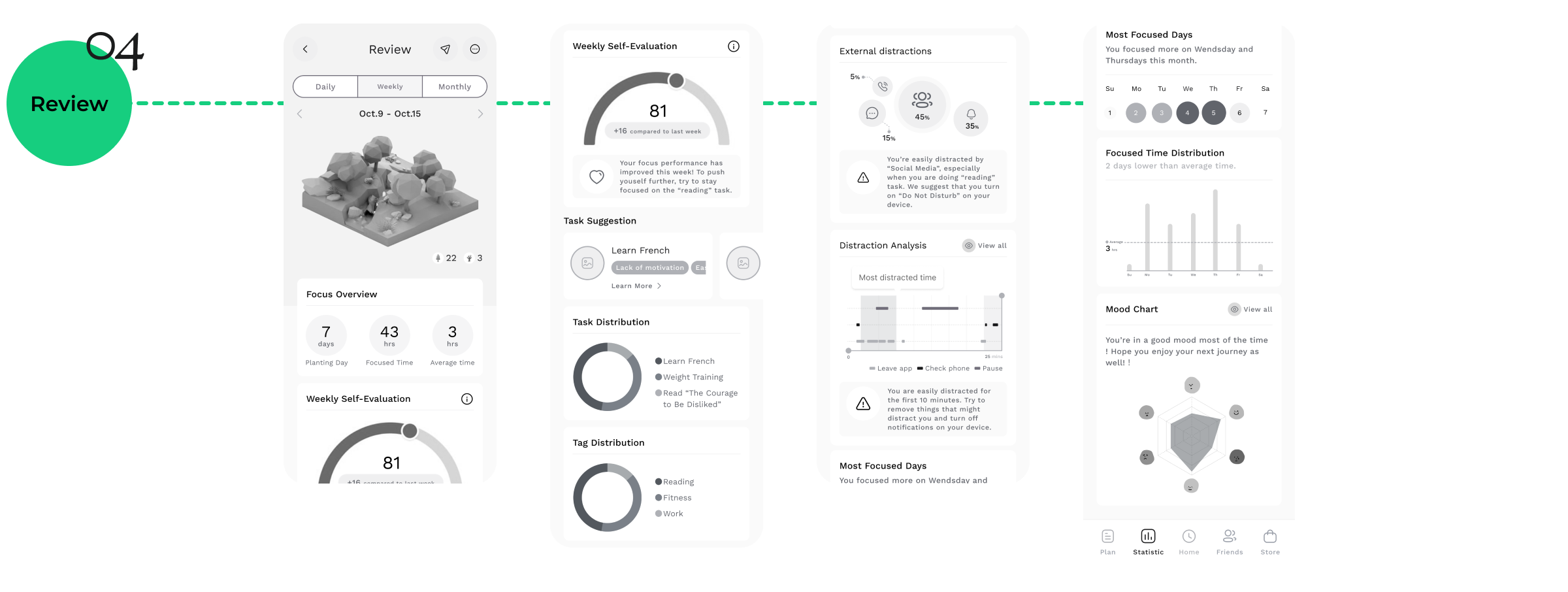
At a stage where users' Jobs to be Done have shifted, the team identified three key experiences, defining the core services the product aims to offer users. Then, through the "How might we?" self-reflection method, we brainstormed what kinds of services the product could provide to meet user needs and solve pain points.
Next, we invited team members to draw an 8-panel comic based on the key experiences mentioned above, brainstorming scenarios of users actually using the product. This helps us understand the various use cases.
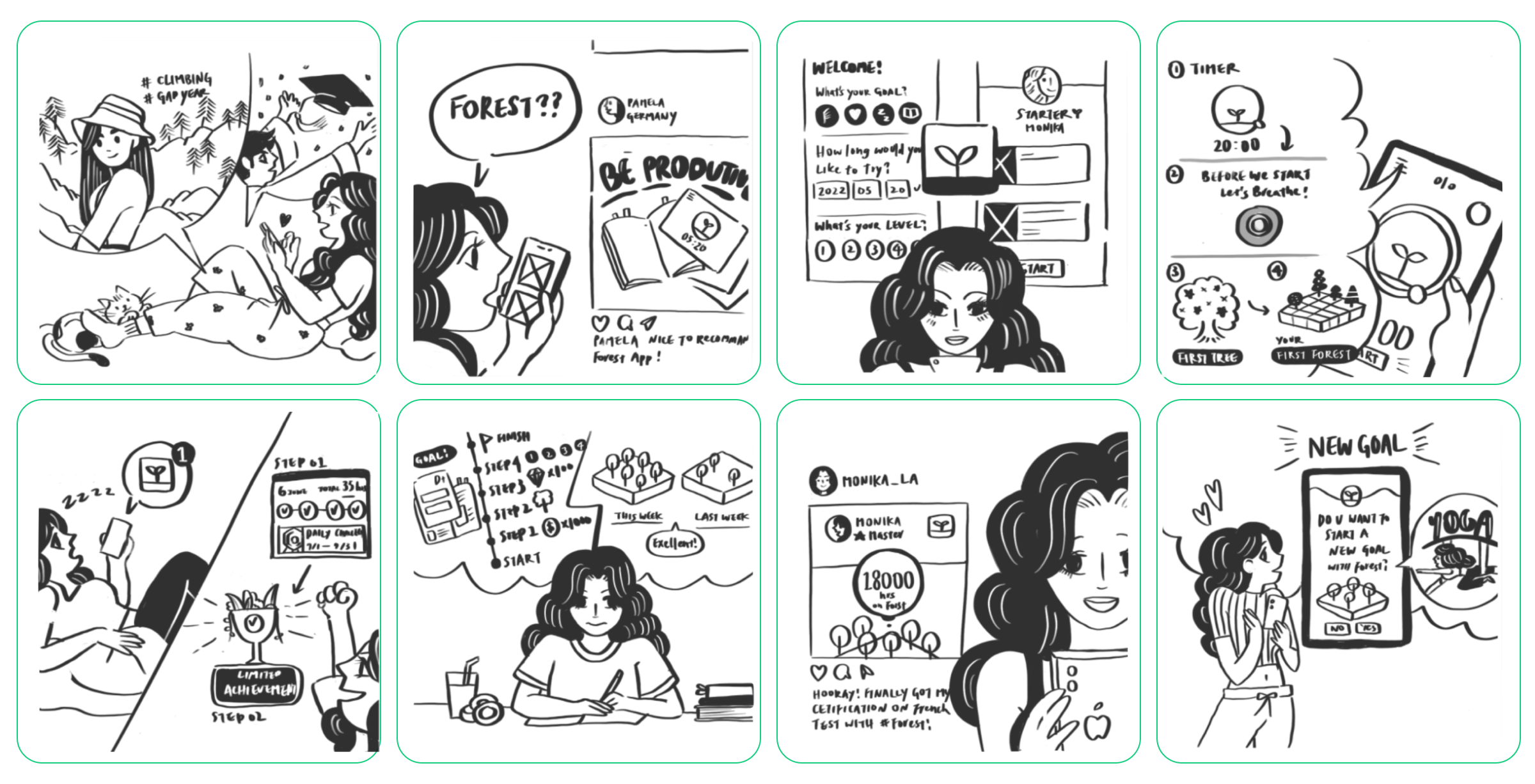
Next, we invited team members to draw an 8-panel comic based on the key experiences mentioned above, brainstorming scenarios of users actually using the product. This helps us understand the various use cases.
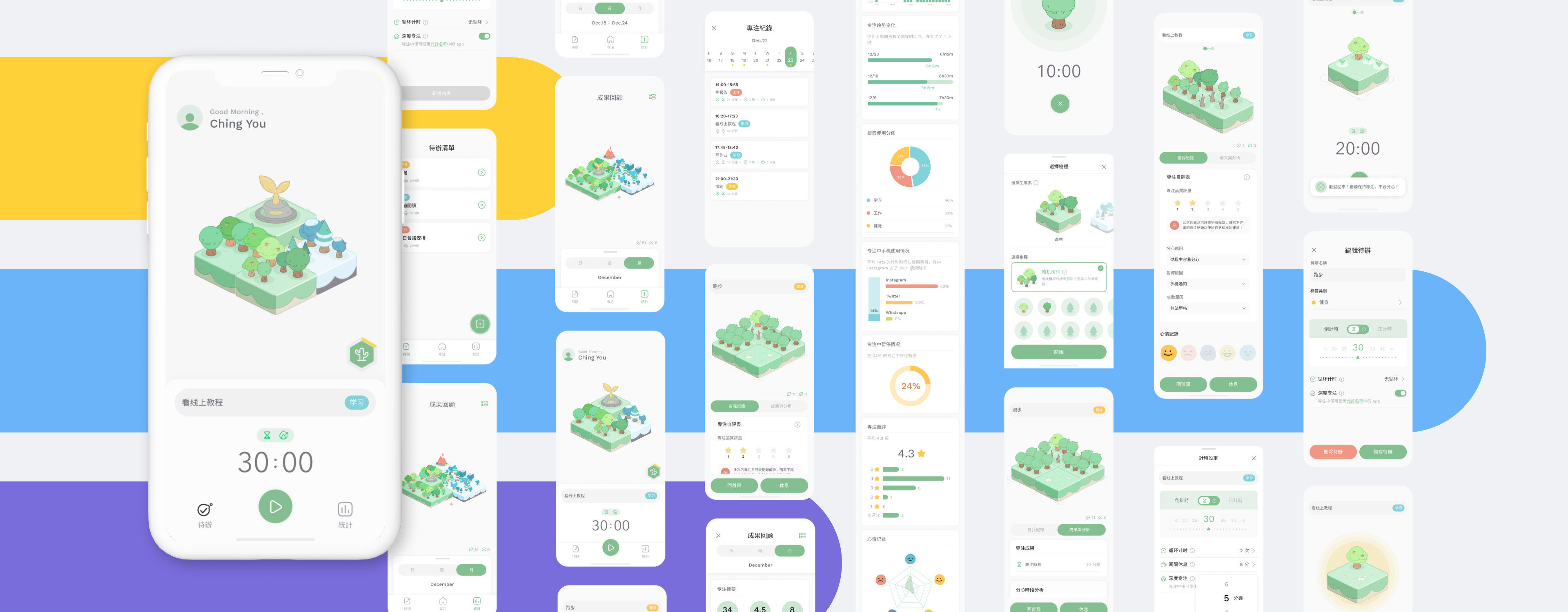
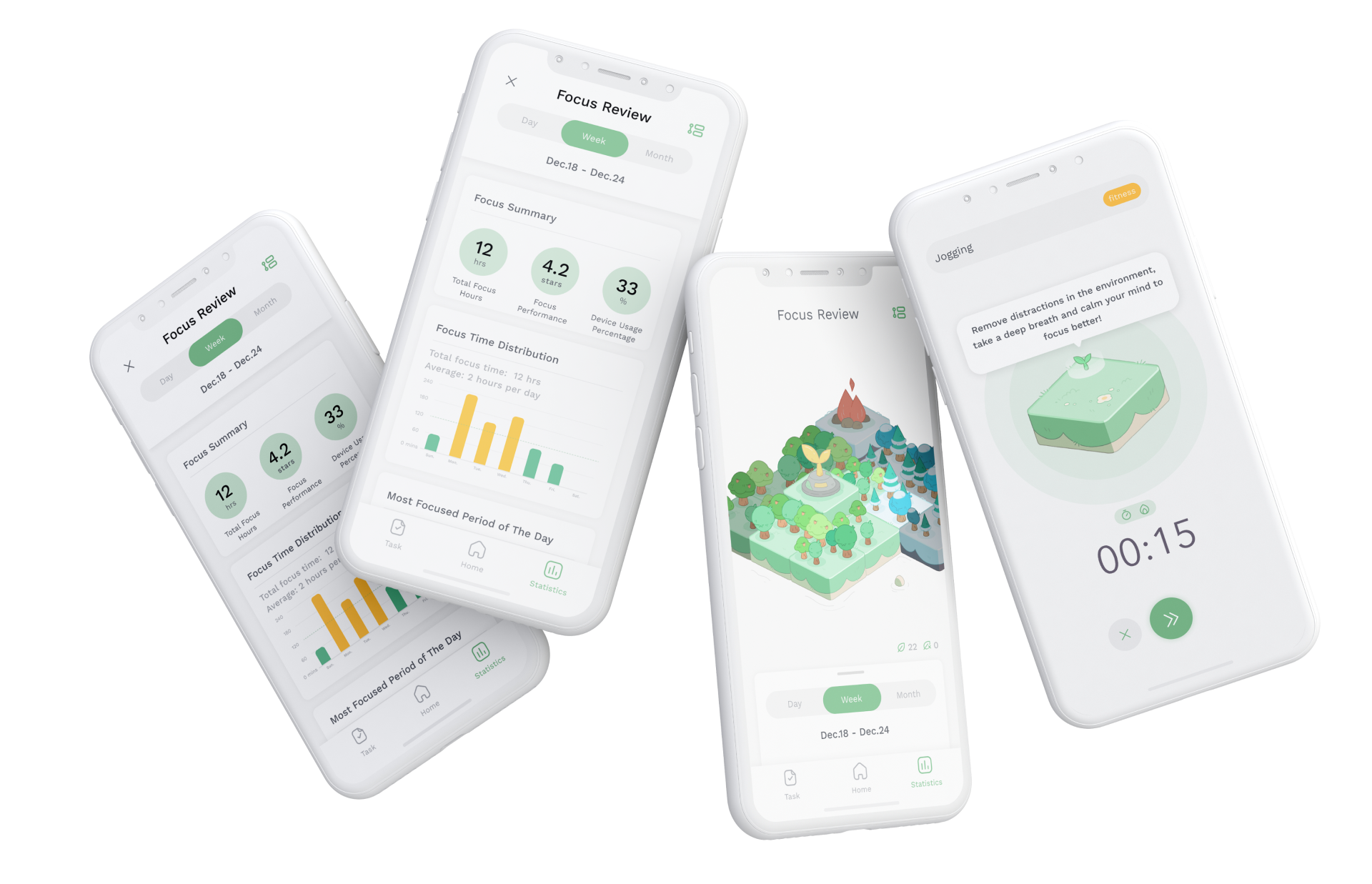
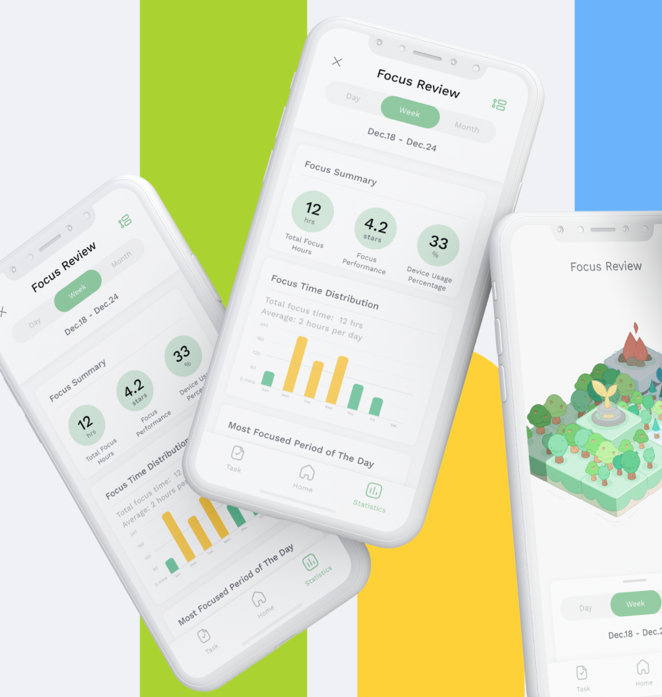
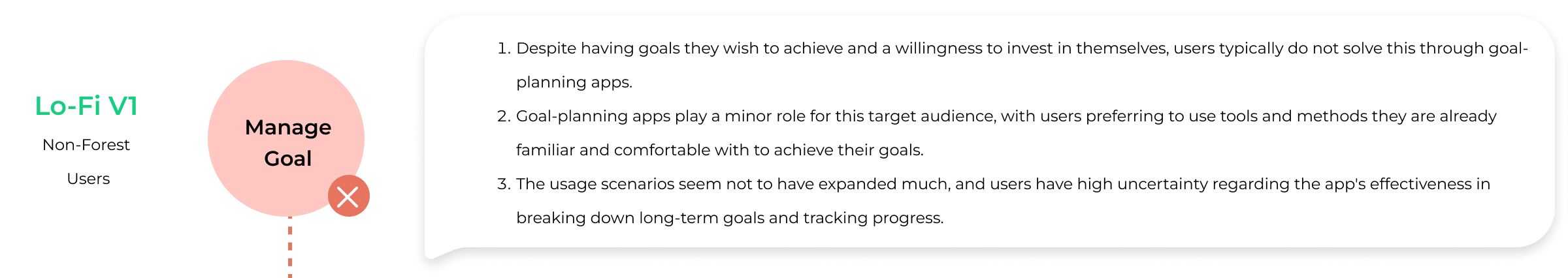
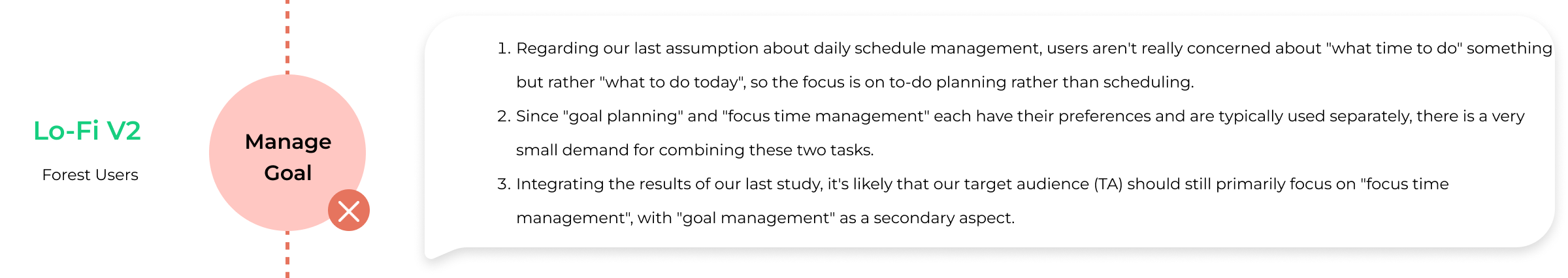
After establishing the basic product strategy and positioning, we began brainstorming foundational features and initiated testing with Lo-Fi prototypes. However, the initial rounds of testing encountered numerous issues, prompting us to continuously revise and adjust the scope and depth of the features.
After establishing the basic product strategy and positioning, we began brainstorming foundational features and initiated testing with Lo-Fi prototypes. However, the initial rounds of testing encountered numerous issues, prompting us to continuously revise and adjust the scope and depth of the features.
Since we have to execute the usability test for several times, I built up a UX Design System that can let everyone
( Including UX researcher, PM, and Product designers) to create a brand new prototype -- This would let the team members discuss immediately with visual results and accelerate the process.
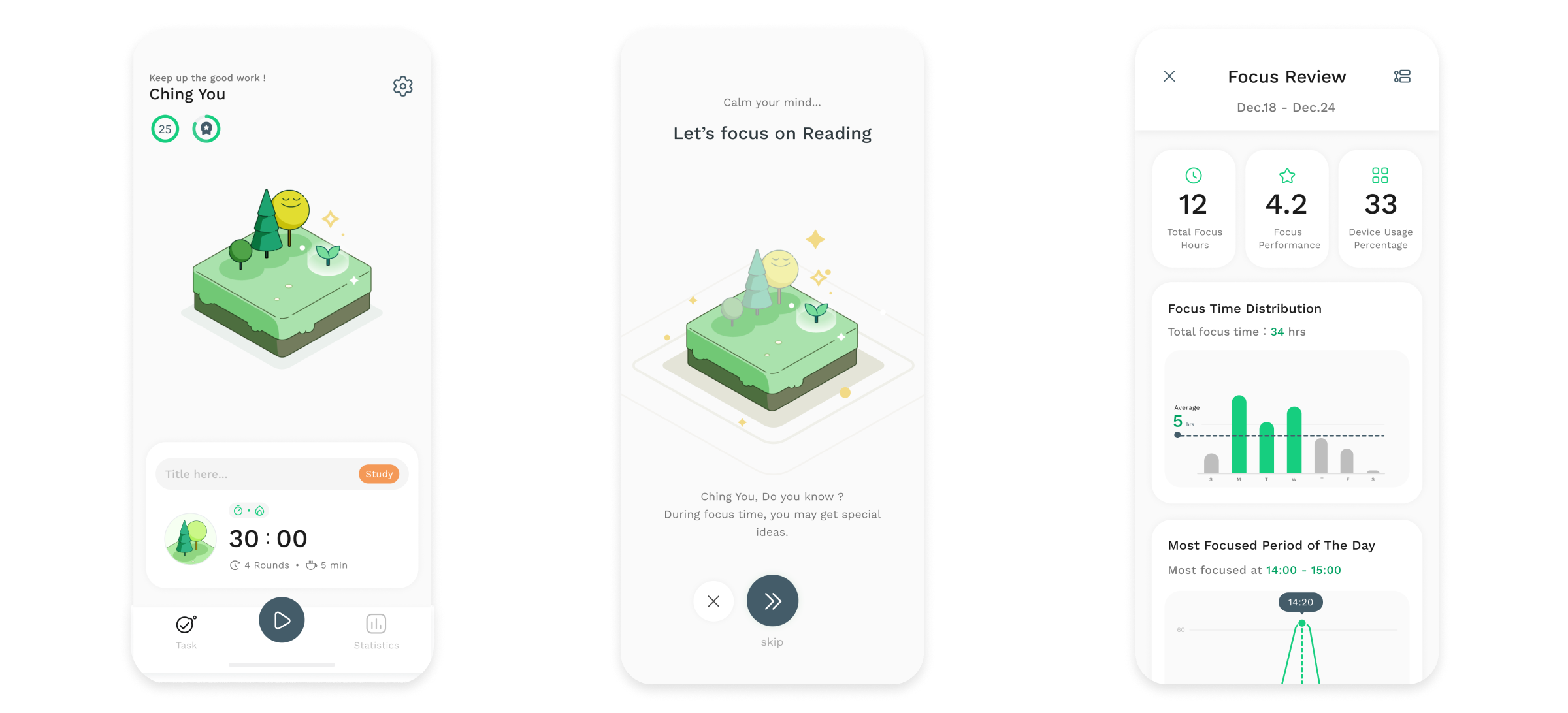
Since the core mechanism of Forest is to continually motivate users to focus through a gamified interface (by growing a forest with focused time), the visual style is extremely important in the presentation of the focus process pages. Consequently, the interface design must be clear and easy to understand, minimalist and clean, with intuitive operations, and possess a page style with stronger color compatibility compared to Forest.
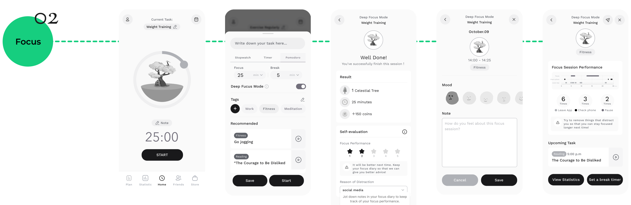
Since the core mechanism of Forest is to continually motivate users to focus through a gamified interface (by growing a forest with focused time), the visual style is extremely important in the presentation of the focus process pages. Consequently, the interface design must be clear and easy to understand, minimalist and clean, with intuitive operations, and possess a page style with stronger color compatibility compared to Forest.
Given that Forest's core mechanism is to continually motivate users to focus through a gamified interface (by planting a forest during focus sessions), the visual style is extremely important in the presentation of pages during the focus process.
Consequently, the interface design must achieve clarity, simplicity, cleanliness, and intuitive operation, possessing a page style with stronger color compatibility than Forest.