The new website aims at redesigning its brand image by maintaining its brand value but extending its original CI system elements. We focus on enhancing usability by adjusting information architectures. Plus, redesign the key visual of the whole website to impress its brand value and make its brand image more trendy.
Rebrand the value to keep up with the development of marketing strategy

Convey Ubiqconn's Brand value -
'' High-qualities '' ''Commitment'' ''Efficiency''

Use the ''CUBE'' element as Ubiqconn's central brand image.
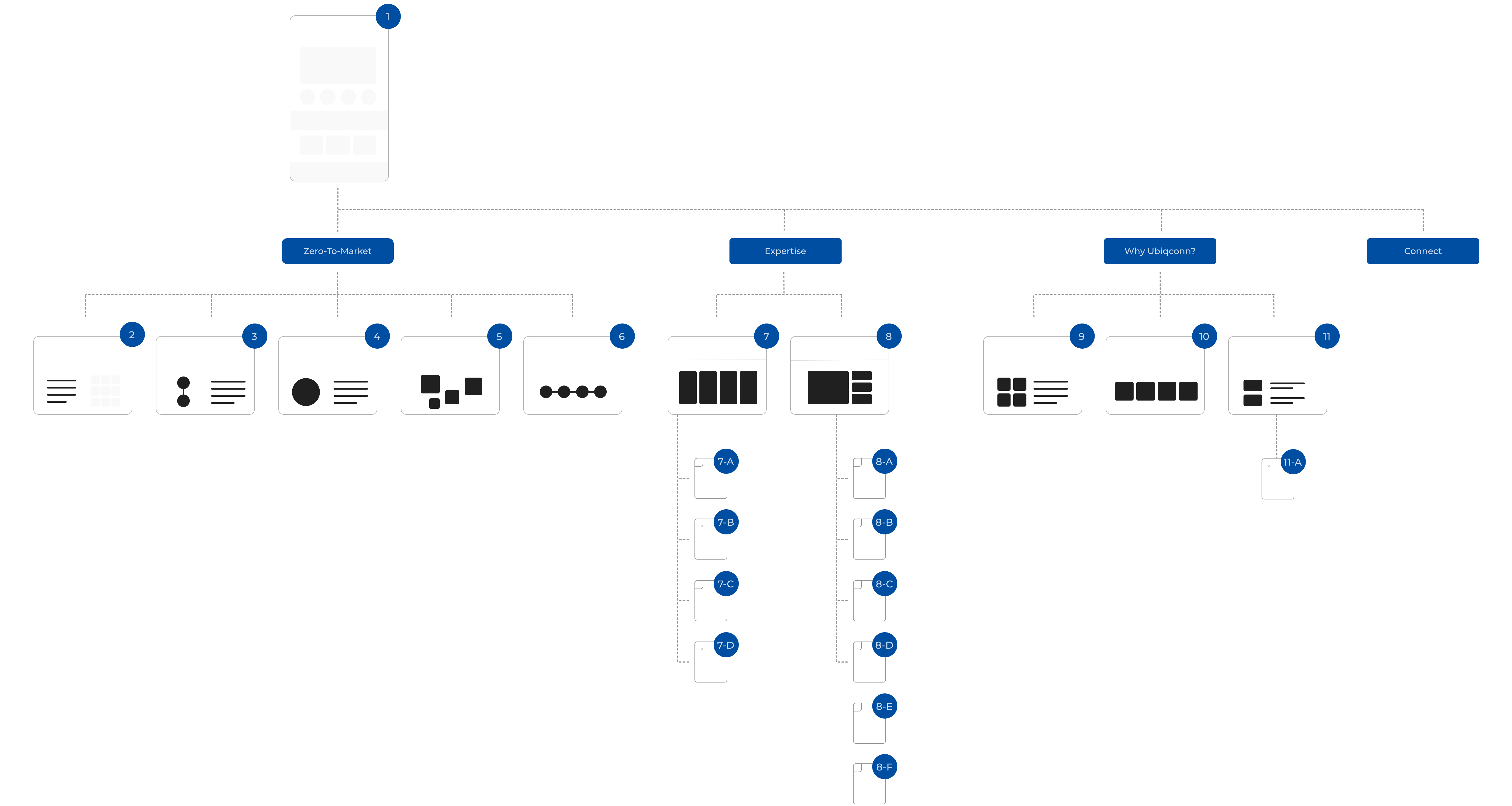
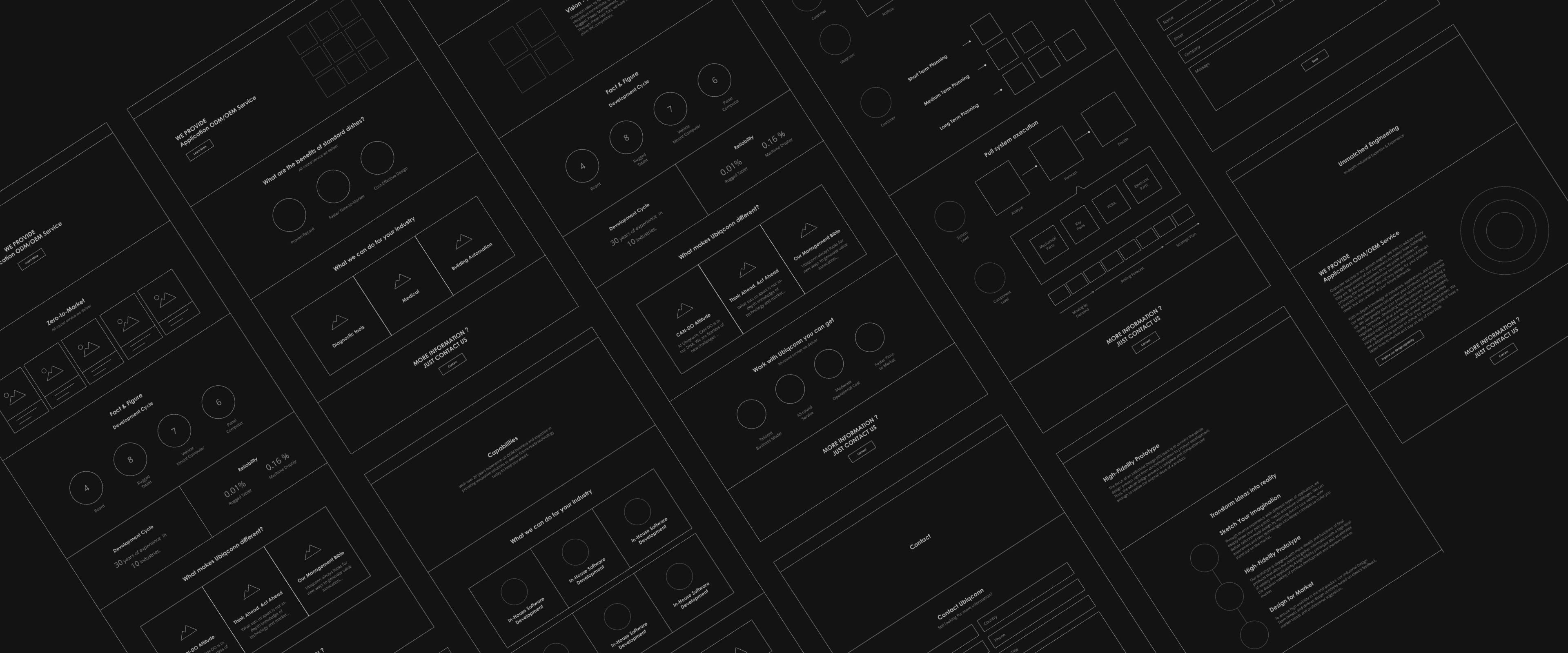
The biggest problem of the official website is that users are unable to find out practical information to know more about the brand information. Instead, users can only see a vast range of different products and their introductions. Consequently, we reorganize the information architecture to make users recognize Ubiqconn's brand value rather than the detail information of products.
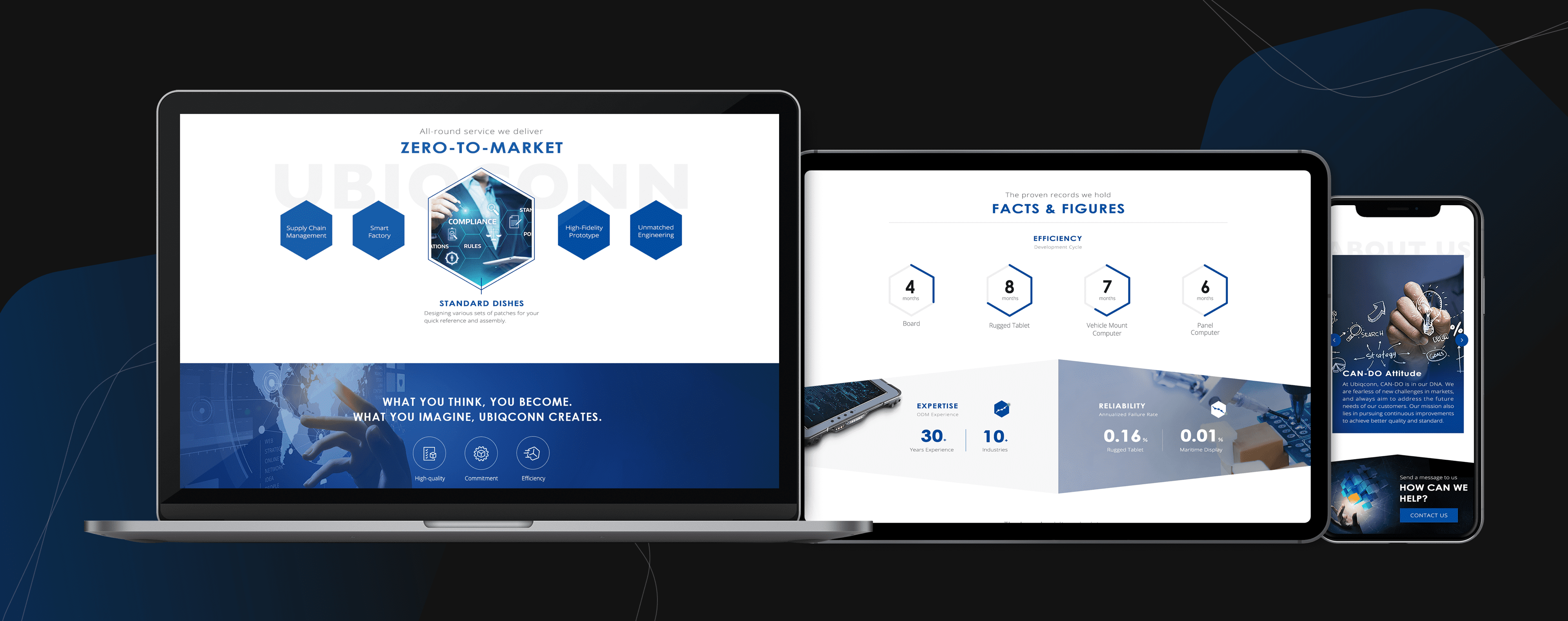
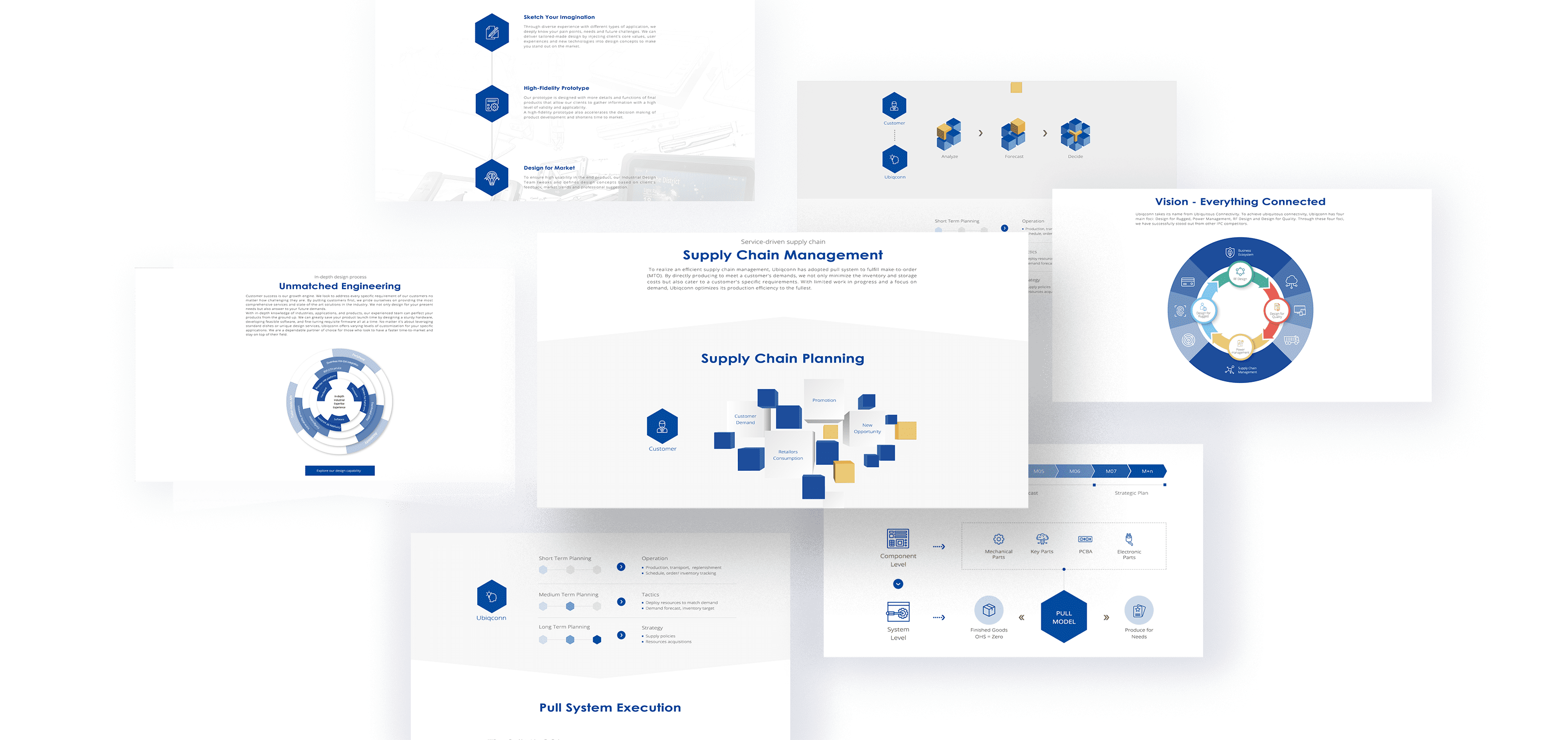
We remove intricate details that are too specific to read and keep the overall layout, both neat and clear, to increase legibility. On the other hand, we produce the imaginations to describe the manufacturing process, which could let users more easily to understand.
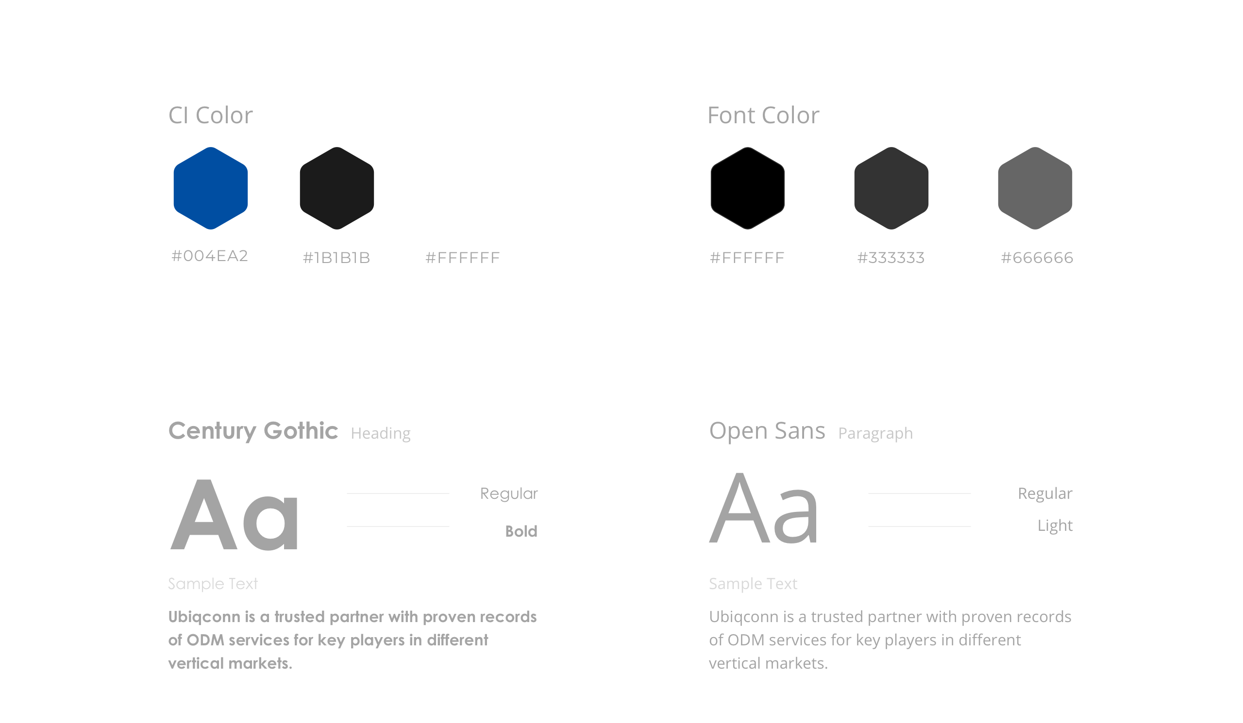
To keep up with Uboqconn's central brand values ''' High-qualities '' ''Commitment,'' ''Efficiency'',
we use dark blue and gray as key visual colors. Besides, Century Gothic is selected to use as a heading font, which can emphasize the Brand identity --- trustful and reliable.
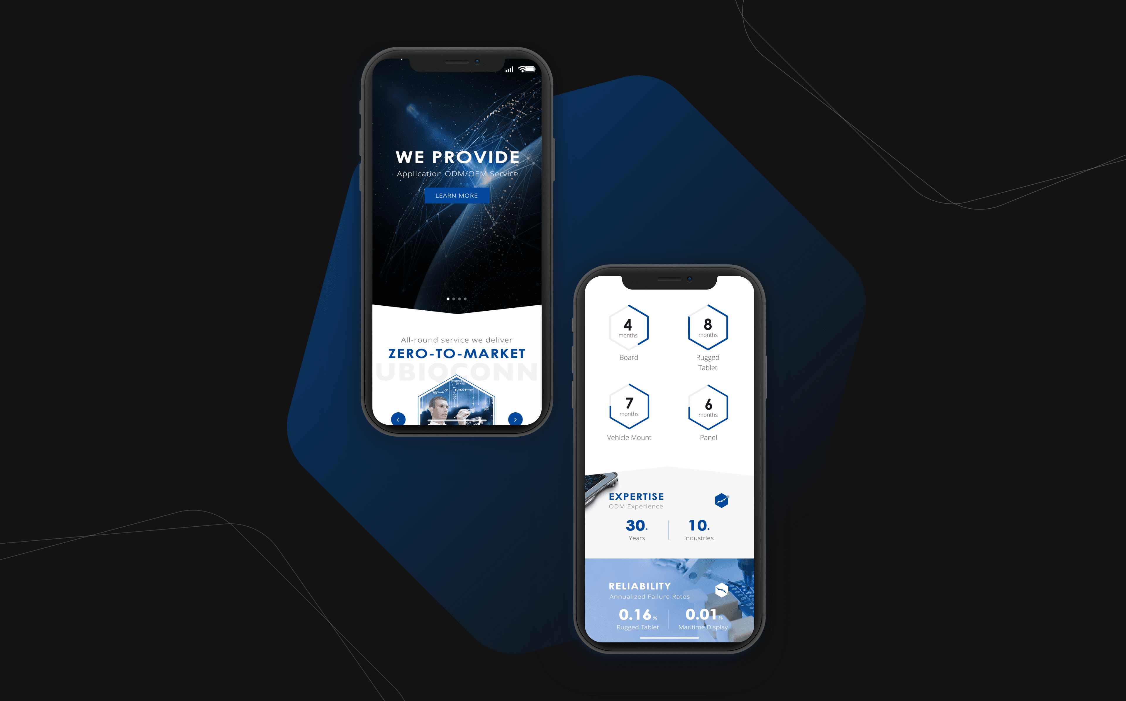
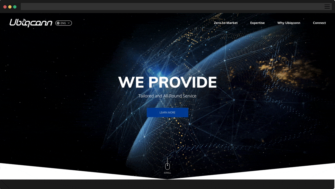
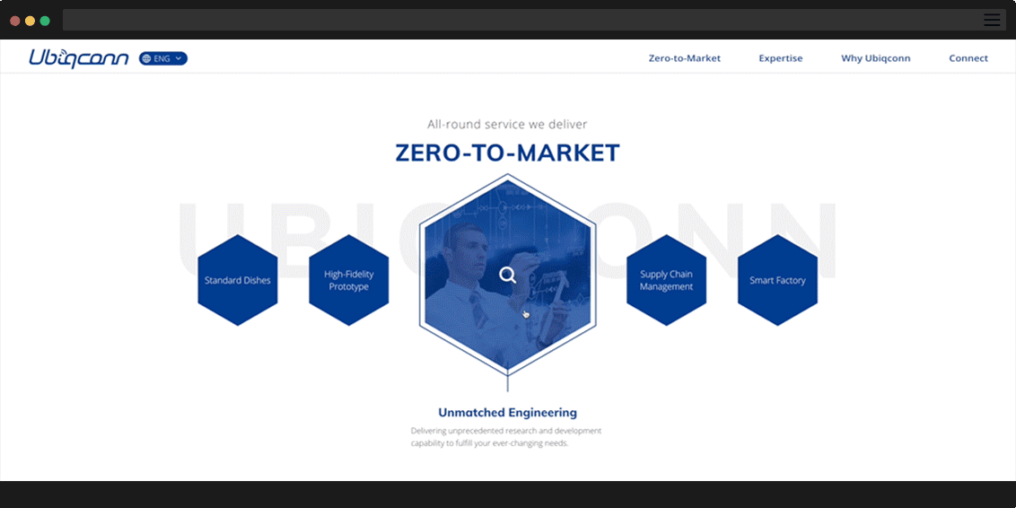
The key visual of the website reveals the professional brand image of Ubiqconn. The images consist of a group of lines and dots, which represents the all-round service Ubiqconn has provided to customers. Besides, we reorganize all the information in the main menu, which is more accessible for users to reach the specific page.
Since Ubiqconn has 30 years of experience in the industry, we believe that the most efficient way to demonstrate its profession is to quantize its achievement. We also produce animations to increase the dynamic of elements, which could make users more enjoyable to read the information.

We hope users can understand all the primary services that Ubiqconn provides. We found out that almost all the users fail to acquire the related information about Ubiqconn's services on the original site. As a result, we made this section as the first step to help users get the initial understanding of Ubiqconn.
Several pages include the manufacturing process. Therefore, we change texts into imaginations, which makes them more easy to understand and catch up. Apart from visualizing the information, we also mix Ubiqconn's branding element --- the cube into these images to emphasize the brand identity and impress users.
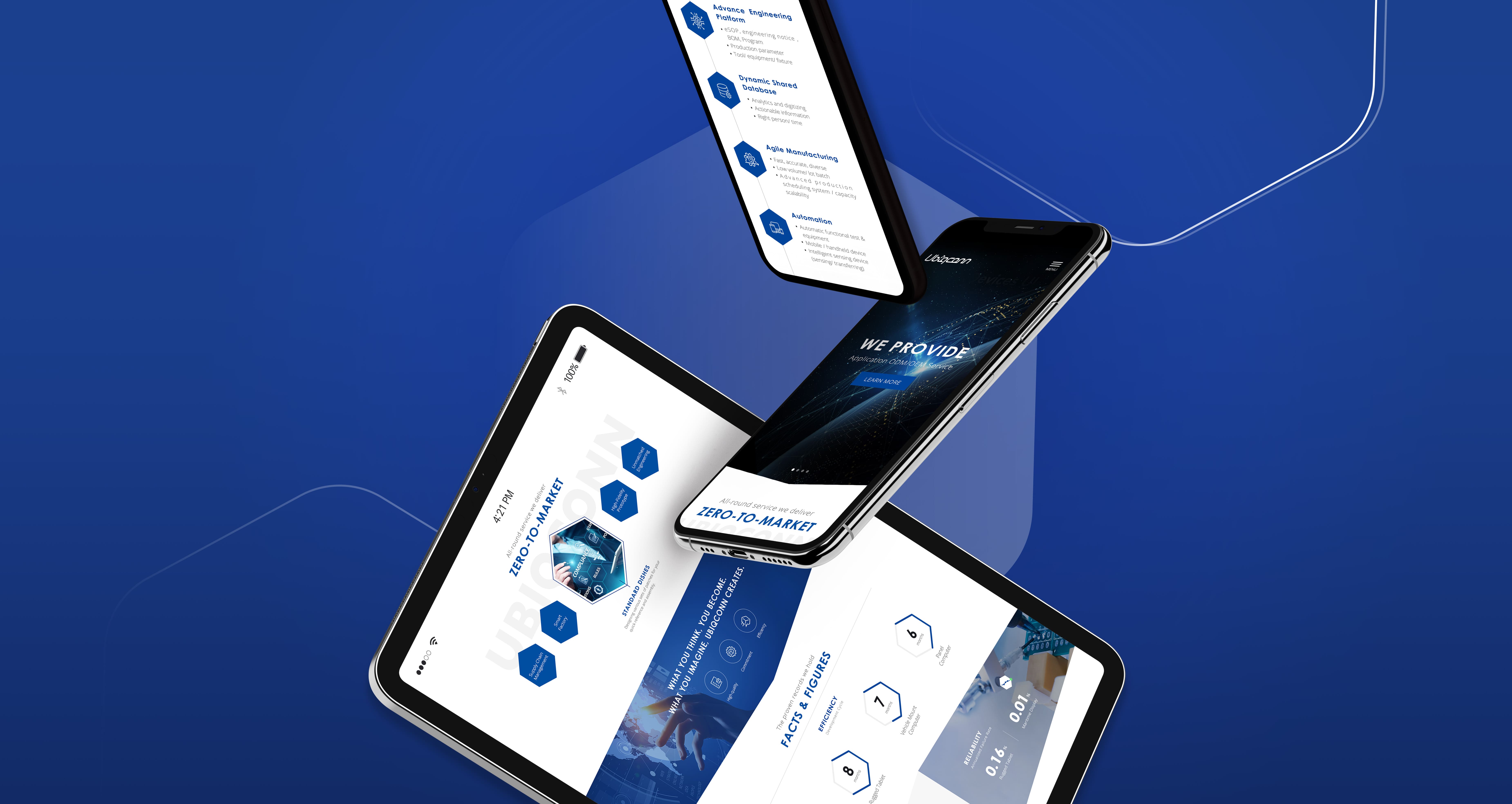
Some of ubiqconn's customers use mobile phones instead of computers to browse websites.
To meet their demands, we concentrate on developing a responsive design.